MAKING IT LOOK EASY
EASY STREET WINS BIG AT STATE AWARDS
Our very own Easy Street just won the award for commercial architecture from the Australian Institute of Architects, which is kind of a big deal. Humbled, we were blown away by the nice things the judges had to say:
"Sited in sub-tropical regional NSW, Easy Street expands on the master plan vision of Habitat as a flexible live/work model in harmony with the natural environment.
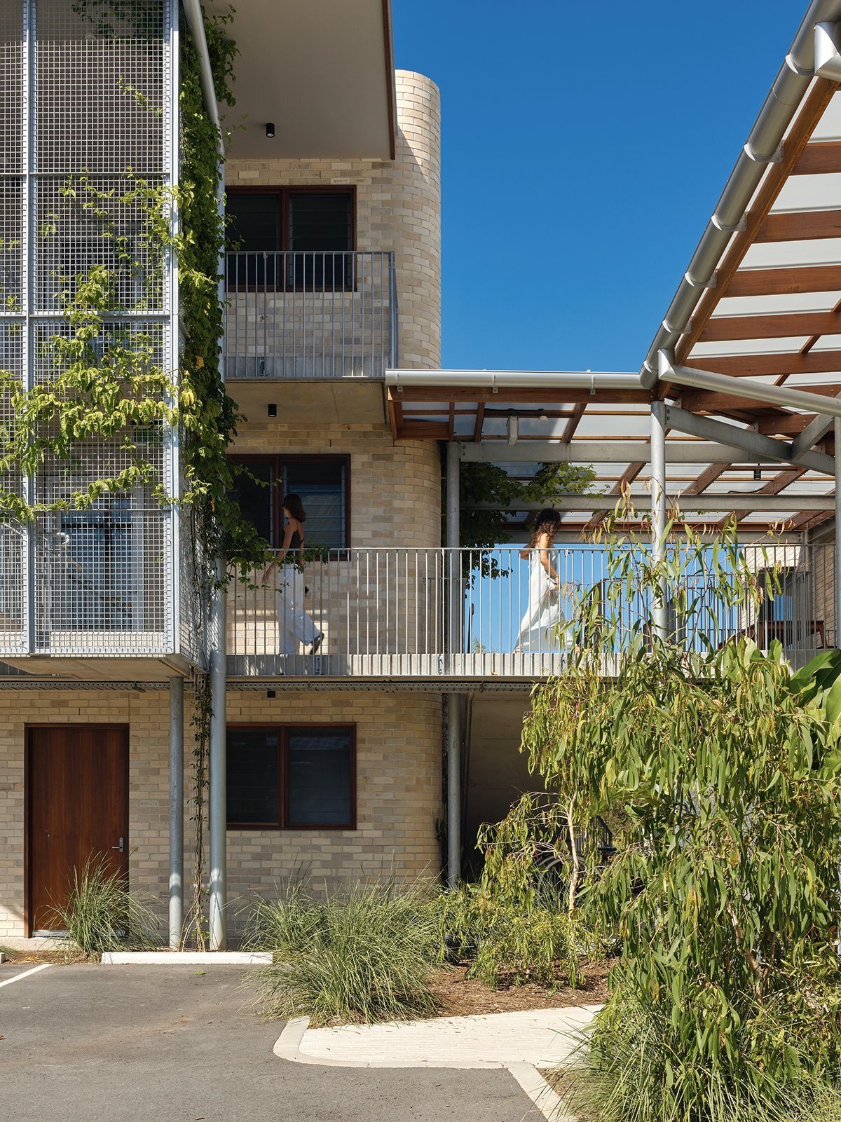
With finely crafted rational construction and detailing, the palette of brick, concrete, steel and timber creates an architecture sensitively attuned to the local climate. Passive design features such as good orientation and deep eaves combine with simple measures for comfort and control: roll down a blind, open a window, or extend your working space out into the open.
Direct, readily adaptable and integrated with its community, Easy Street reminds us of the fundamental design principles in creating sustainable environments, for now and for the future."
Not usually ones to toot our own horn, we know it's important to honour moments like this and celebrate the people behind them, so we dragged Fraser Williams-Martin, who designed Easy Street, out from the shadows for a quick interview to get his reaction and shower him with some much-deserved praise.
You kept saying you didn't think Easy Street would win. Were you being humble or just managing expectations?
It was up against some tough competition from the big boys in Sydney, so when I looked at the shortlist and saw the scale, location, and prestige of some of the other projects, I honestly didn’t think we had a chance. The project did stand out as different to the rest though, smaller and far less shiny, so perhaps that caught the jury’s eye. Either way, I was over the moon when it won. Being from the UK, it felt like validation of my Aussie credentials.
When did you start designing Easy Street and what were your inspirations? Did it come... er... easy?
Twenty nineteen was when the bulk of the design was done. I spent Covid lockdown resolving details, setting out brick courses, and adding the "little moments" with Hubble, my cat, sat on my keyboard.
Sometimes you’re lucky enough to have an idea early in the design phase that you know just works and doesn’t need questioning too heavily. That was the case with the sawtooth roof building. It just felt right and from there, the rest of the design flowed relatively easily.
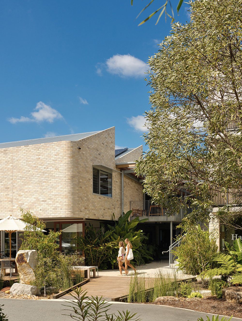
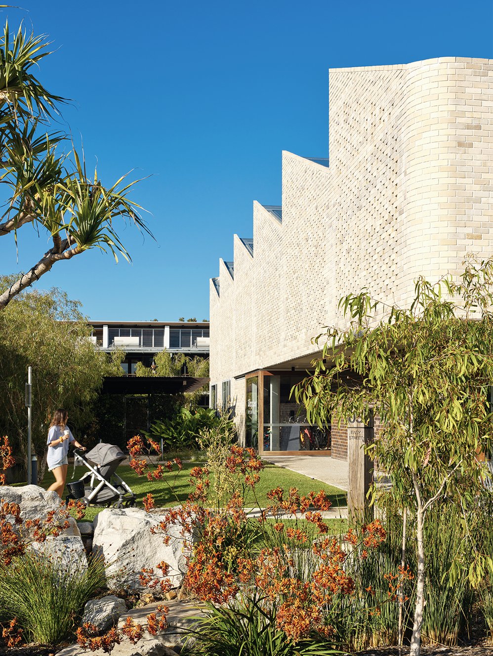
It was critical to design a form that worked with the nearby recreation precinct’s winged roof. For me, that was the sawtooth roof, a classic industrial form and reference that's inspired by the nearby arts and industry estate. Somehow the two work well together, rather than being in competition with one another.
What are you most proud about Easy Street?
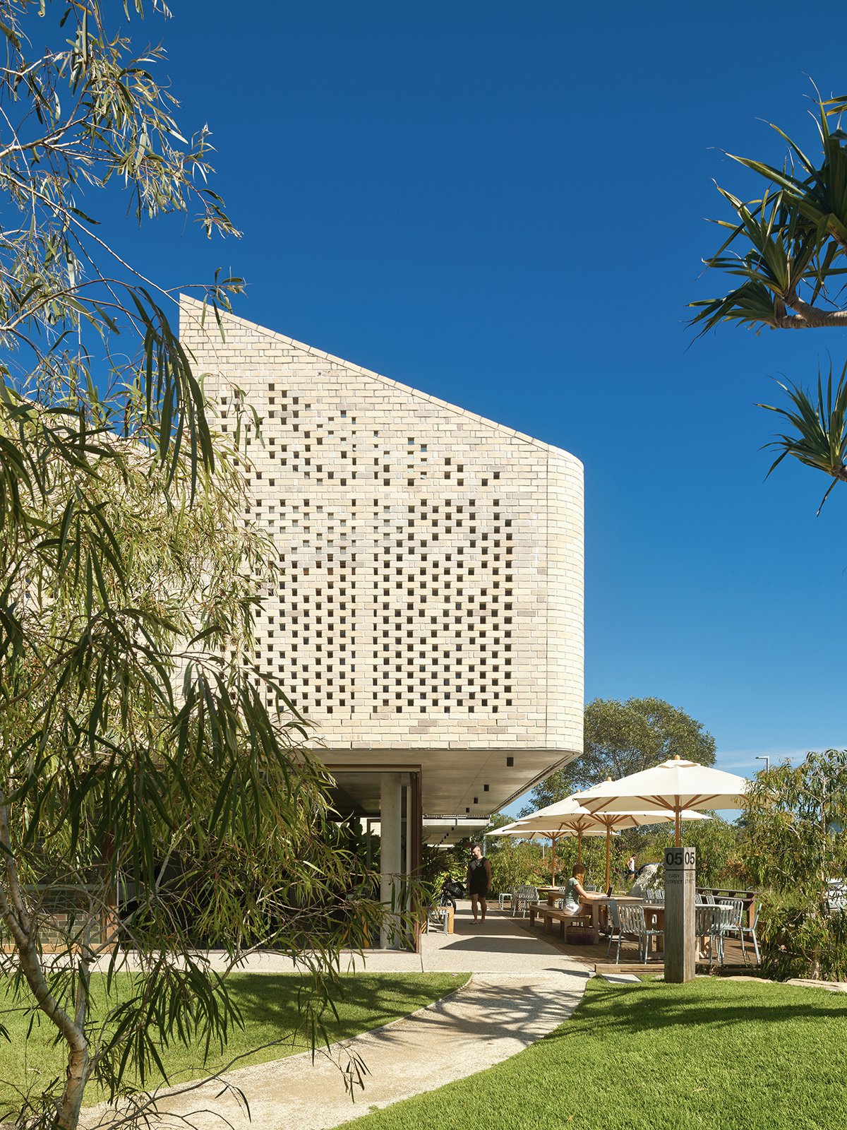
A few things. The "hit and miss" bricks and the sawtooth roof, because the health & wellness businesses in this building require a balance of privacy, natural light, and views, which the high ceilings and hit and miss bricks facilitate. There's light from above, coming from high level windows and skylights, restricted views through the hit and miss bricks, while retaining nice views out.
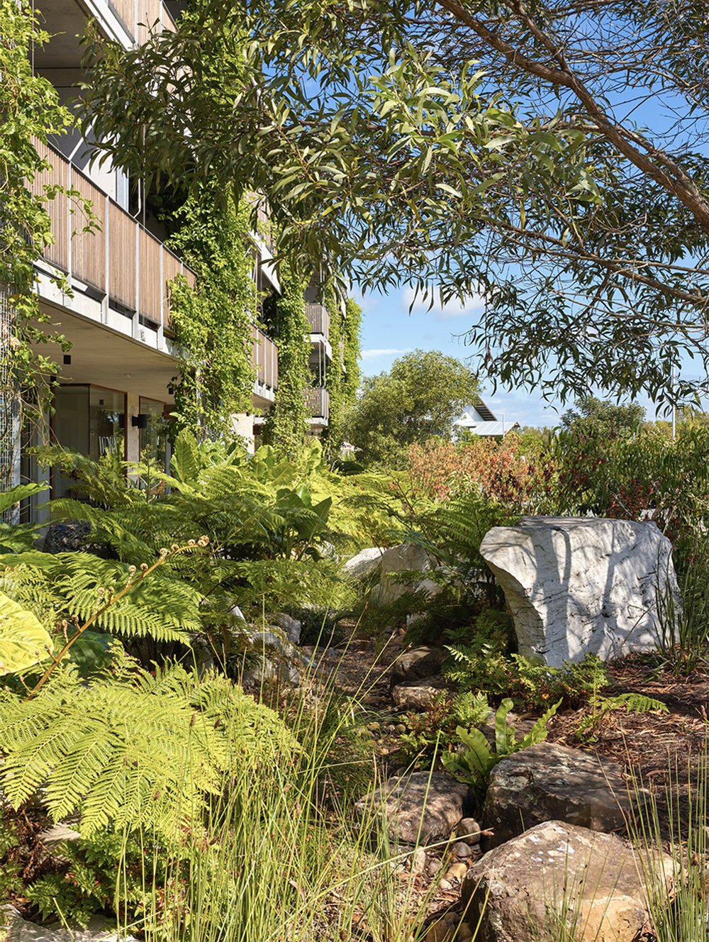
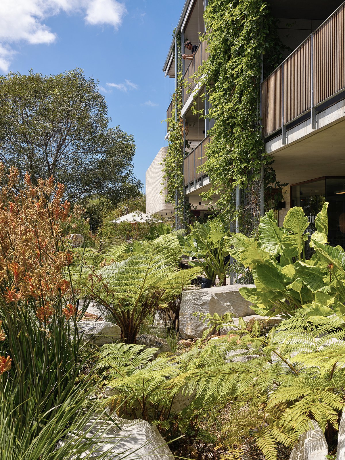
Also, the swale down Easy Street. It's a bold move to have that degree of landscaping along a street. There was a lot of budget committed to landscaping, which isn't the norm. As a result, there's lots of spots for people to sit, hang out, make a phone call, and generally enjoy being close to nature in what’s essentially a semi-urban environment.
What's something you love about the design that not many people would notice?
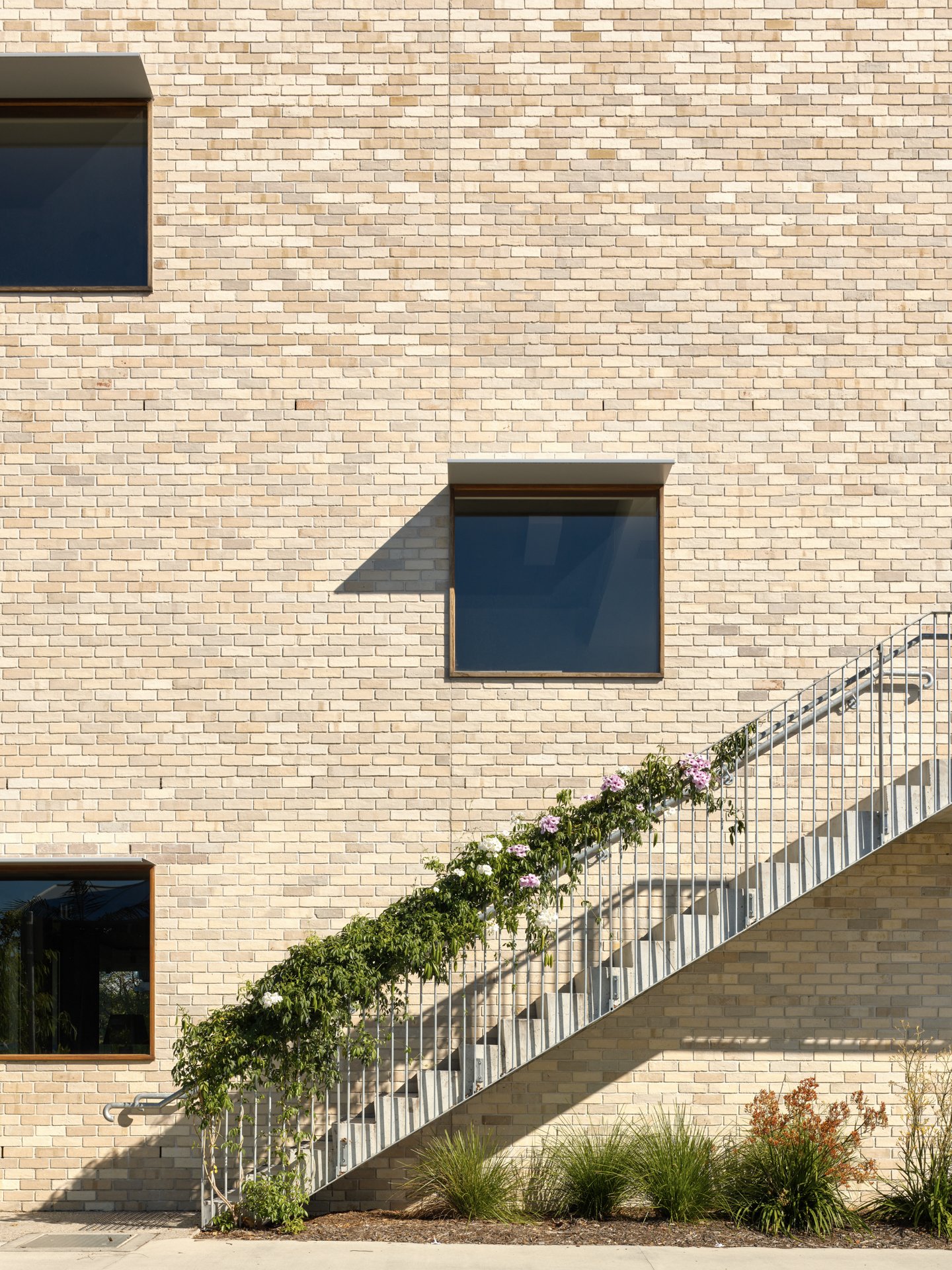
The elevation from Gallagher Street. I love super simple, well-proportioned and functional elevations. A blank wall, a few staggered windows to the retail and offices, the silhouette of the balconies and a single set of stairs with a few plants growing up it. I’m super happy with that. It's unassuming but genuinely assured.
You've evolved the design of Habitat with each new stage and yet it all fits together. What’s the trick there?
Easy Street Commercial is very much an evolution of what already exists at Habitat. It was important that at its core it had the same DNA as the rest of Habitat, whilst also feeling new and fresh, offering something different. The landscaping, external walkways, covered outdoor meeting rooms, permeability, hidden spots, and mix of tenants, are all key to what makes Habitat Habitat. So, it was about taking these elements and executing it all in a new and exciting way.
How did the location of Byron Bay influence the design?
The climate makes people want to be outside as much as possible. You don’t come to this region to be sat in an air-conditioned box with artificial lighting, you come to be connected to nature and the environment. We’ve tried to facilitate that. Whether it’s walking to a meeting, grabbing a coffee, or catching up with a friend, it’s usually better to be doing these things outside. But it’s also hot and rains a lot, so cool, covered spaces are critical wherever possible.
Favourite material used on Easy Street and why?
I love the bricks obviously, shout out to Krause, but I have a crazy love for the simplicity of Danpalon, the polycarbonate roof sheets between the buildings. It’s such a basic material but does a job that no other really does - it insulates against the sun, protects in the rain, while also allowing a super pretty and diffuse light into covered spaces. I love it.
How much does the landscaping have to do with the good vibes of a place like Easy Street?
Everything. Too many projects fall short when it comes to spending on plants. It’s the first thing to go when looking to make savings. I believe that’s a major error. Most people don’t really love buildings, other than architects. They love the spaces they create in and around them, especially when they’re chock full of plants and greenery. The landscaping along Easy Street is arguably the real hero of this project and something I’m super proud of pushing hard for. The natural swale, green screens, shade, rocks to sit on – that’s what people are drawn to and what facilitates gatherings and a sense of community. You want to hang in a park, not a carpark. Thanks Alex, our landscaping guru.
If you could design a building for anyone, who would it be and why?
Thom Yorke. I feel we’d nerd out well together. I’ve designed a lot while listening to Thom wail away, so really I owe it all to him.
Since designing Easy Street, at DFJ Architects, you've moved onto become Creative Director for Creative Capital, the team behind Habitat. Does this mean we won't get to see any more award-winning designs from you?
For me, architecture has always been about more than just pretty buildings. I’ve been fortunate enough to work with people on projects that extended my role beyond just being an architect. It’s about who’s in buildings, what they’re doing, the mix of uses, the public spaces around them, the landscaping, marketing, events, the context of the location, the town, the climate, and culture. My new role is just a formal reflection of what I’ve been doing for years. I’m still designing buildings and collaborating with other architects. The beauty of this role is being able to structure the best possible team for each project to ensure the best possible outcome.
What's next on your to do list?
Too much! I’m a busy boy. We’re working on a whole heap of interesting projects, from innovation hubs and hotels to housing for women and children, and upgrades to the homeless centre Fletcher Street Cottage, plus heaps more. We’re also putting together a resilience manifesto for the Byron Shire, which is a beautiful blueprint on how to look after Country, build stronger communities, design better developments and keep the Byron Shire wonderfully weird. We’re hoping to launch it sometime towards the end of August, so watch this space.
Other than that, golf. I’m a newly inaugurated member of the "Crappy Clubs Club" which is a safe space for a couple of guys to distract themselves from the pain of existence through the joys of golf.
__________
Special thanks also to DFJ Architects (John Eden, Amber Garde and Lucila Greco).
And special thanks to Bennett Constructions and InRock Landscaping.
Images by Christopher Frederick Jones.


